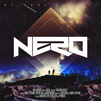
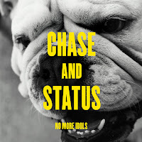
These three posters are by Chase and Status and Nero, advertising upcoming shows and tours. Although I am planning to create an advertisement poster for the EP rather than a tour, I can still use these products to get inspiration and an idea of what style to use.
As seen on the CD covers, Chase and Status have a very simple style with a minimal colour palette. They do not overcrowd the poster, connoting that they are a group which need no introduction. Their audiences will be accustomed to this style and will know what kind of designs they are looking for when it comes to finding Chase and Status products.
This poster for Nero uses the same image as the one for the CD cover. This synergy means that it is instantly recognisable for the audience and there is no ambiguity over who the artist is.
For my advert, I will take inspiration from the Chase and Status posters by keeping it simple, and also take the idea of having an image which is heavily linked to the song and video and recognisable for the audience.
28 January 2012
27 January 2012
Research of CD Covers



These four CD covers are of a similar genre to Chase and Status but all have their own style. However, something which stays the same throughout is a bold album name and title which stands out - this will suit the audience's needs as they will be obvious in a CD store such as HMV. The images on all four are, although obvious, not too detailed as to detract the attention from the CD text and have a central focal point.
25 January 2012
Research into Ancillary Task
I have searched for the album and single covers that Chase and Status have used in the past and have found these:
The most noticeable common theme that the four covers have is a colour palette of around three colours: black and/or white seem a favourite, but the desaturation of the two colours are contrasted with a much more vivid and brash colour. In the cover of 'Pieces', there is a number of shades used of the green, but the shattered effect ensures that the boldness is not lost.
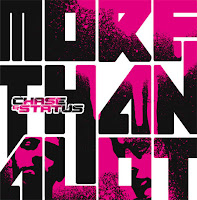 They are also very simple in their design with the band and name of the CD as the most prominent feature. They also all have some form of a design as a background or underneath the text: the dog in 'No More Idols', the band members in 'More Than Alot', the small picture of the dog in 'Blind Faith' and the shatter design in 'Pieces'. This meets the audience's needs as the CD will be easily recognisable in a shop as it is a common theme for Chase and Status to use.
24 January 2012
Ancillary Task
Our second part of the coursework is to create a digipack and either a magazine advert or a poster for the song we have used for the music video. The digipack requires a front cover and a back cover, with two images for the inside of the pack too. However, before I begin focussing on the separate tasks I am going to research into the styles of images and text that bands like Chase and Status use.
21 January 2012
Rough Cut Feedback
After handing in my rough cut of my video, I have been given useful feedback. This is a helpful way of developing my work as it is easy to get too involved with the product and an outsider's fresh perspective can give advice that I would not have otherwise realised.
One of the pointers that I was given is that the narrative is not clear enough and is a bit 'choppy'. Currently, the footage constantly goes back and forth over his struggle to overcome his addiction whereas I have been advised that to split it into more obvious sections would make the narrative clear to the audience. The way that I am now going to rearrange my clips is by the introducing the protagonist and his problem; temptation; the rabbit; his struggle to overcome it; and then his relapse and have fast cuts of the footage previously seen to show how it is a dangerous circle which he is struggling to get out of.
Another pointer is that, despite having the light rays effect, the chorus' and the fantastical narrative is not different enough. I understand this as the chorus is when the music really builds up to its peak and so I need to reflect this in my video. Therefore, I am going to add the RGB effect on top of the light rays so that I can create more of a contrast without losing the effect.
13 January 2012
Light Rays VS Colour Tint
 As the fantastical narrative needs to be different to the reality, I am going to manipulate the footage with a special effect.
I really like the 'Light Rays' effect as this makes the footage have almost a supernatural feel as it creates connotations of a tunnel and the 'temptation' character is at the end of it - somewhat like the "light at the end of the tunnel" which clearly links to the protagonist's feeling that his alchohol dependency is the only way forward.
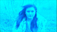 However, by adjusting the RGB balance I am able to give more of an impact, particularly against the black and white effect. This feature enables me to put a tint across the footage.
Even so, I feel that the light rays are more unusual and suit the narrative better.
10 January 2012
Black and White VS Desaturation
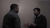 For the shots in reality I am battling whether to put a black and white effect across the footage or desaturate it to around 70% as this still leaves some colour.
 Although I really like the effect of both of these, I feel that the black and white is more striking, whereas some of the shots that are desaturated appear quite dark and dimly lit. In order to meet my audience's needs of having a video which is easily viewable and of high quality, I am leaning towards using black and white.
5 January 2012
Lipsyncing
Looking at my footage, I am really pleased that both my actors have lipsynced to the song really well. From my 'Radar Love' practice video, lipsyncing was one of the biggest problems that I faced and so much time was spent trying to get the footage to match the song.
However, so far, I have not come across this problem and so this means that I will have more time to focus on manipulating footage and arranging it.
However, so far, I have not come across this problem and so this means that I will have more time to focus on manipulating footage and arranging it.
4 January 2012
Started Editing
In today's lesson I uploaded the footage onto the Mac. This took far longer than anticipated due to the amount of footage I had. I went through my clips and deleted any ones which were not needed. I have also downloaded a version of 'Blind Faith' which I can import into Final Cut, as the copy I have is protected by iTunes against duplicating.
I am eager to start editing my video as soon as possible as I am looking forward to seeing it all come together.
I am eager to start editing my video as soon as possible as I am looking forward to seeing it all come together.
3 January 2012
Representation of Gender in Videos of a Similar Genre
In this video by Chase and Status, there is a clear representation of gender. The female is portrayed as disrespectful by breaking and entering into his flat and vandalising it (1:30), promiscuous (2:05)(3:25), and cruel in her action against her partner (the singer). The lyrics of the song connote that the male was committed to the female but she threw it back at him. Therefore, the male is portrayed as the victim.
This is unusual as commonly in genres such as drum and bass, the females are often sexualised and are dominated by the men who are often the ones who are shown to be adulterous and have a lack of morals.
In Wretch 32's video, for example, the women are dressed in revealing clothing and are dancing in a sexually suggestive manner. However, the lyrics are not about women which suggests that gender is a heavily used topic in music videos.
Contrastingly, Miami to Ibiza by Swedish House Mafia and Tinie Tempah is much more explicit in it's language about women. In particular, lyrics such as "I tell her, wear suspenders, and some PVC" (0:26)
Subscribe to:
Comments (Atom)


