8 February 2012

Images for my Ancillary Task

For my ancillary task, I am including images of the male character and the rabbit as these are the two most prominent features of the video.


Rather than importing a still from my video, I am going to take photos of the rabbit and the protagonist in front of a blank wall so that when it comes to using Photoshop to edit them it will be easy to manipulate the background.

3 February 2012

Paradise - Coldplay


Although a different genre of music and narrative, Coldplay's video for 'Paradise' is similar to my music video as they both use animals as a significant and key feature (elephant/rabbit). As the song has reached the top of the charts and the VEVO video hits on youtube is over 64 million, the elephant has become a symbol of the band and song, as well as getting people talking about it as it is an original and exciting idea.

Coldplay are furthering this by dressing as elephants for live shows as well (footage is seen in the 'Paradise' video) which is more advertising for the song.


Thoughts for my Ancillary Task

After researching into CD covers that Chase and Status use, other bands of a similar genre use and key features of my music video, I am leaning towards having the rabbit in both the CD cover and the ancillary task. For my ancillary task, I need four shots for the CD (front cover, back cover, inside left, and inside right) and a shot for my poster.

Most of the CD covers are simplistic in their design, and so, although the wood is used as a main location in the music video, I feel it would be more significant to have the rabbit against a blank canvas. This would also allow me to have the text of the artist and song title in lettering which would be easily noticeable and not lost against a detailed background.

For the poster, a similar style should be used so that the audience can see a clear link between the music video and the digipack and poster. This would create some kind of 'symbol' for the artist and song which could then be an easily recognisable feature. The blank canvas would mean that details of the song are easily read.

Recognisable Features of my Music Video

The church plays a significant part in both the setting and the narrative of my music video. If I were to use the church for my ancillary task, it would be beneficial due to this but disadvantaging as I am unsure whether it is easily recognisable.

Having my protagonist walking alongside the woods is a sequence that I use quite a lot in my music video. It is a symbolic shot of the narrative but, similar to the church, I am not convinced that it would meet my target audiences' needs in being a clear reference to the song. 
The sequence of the protagonist and his father is a key feature in demonstrating the tension the protagonist's addiction is putting on other people. I could definately gain inspiration from this shot, but specifically this footage would not be suitable as the colours are not bright enough to get audience's attention. 
Drink is a key item in my music video and so it would be necessary to involve it in my ancillary task. However, I would not use it as the main feature of the poster or CD cover as it is quite a common prop in narratives for music videos and so perhaps may not be immediately linked to 'Blind Faith'. 

The rabbit is the most recognisable and significant feature of my music video; it demonstrates the protagonist's addictions and how he is spiralling further from reality. 
The shot of both the rabbit and the protagonist together is significant because it shows the protagonists' new reality and perspective based upon drink, and also how he tries to confront his addiction (facing each other in a kind of 'stand off' position). 

28 January 2012

Research of Posters

These three posters are by Chase and Status and Nero, advertising upcoming shows and tours. Although I am planning  to create an advertisement poster for the EP rather than a tour, I can still use these products to get inspiration and an idea of what style to use.

As seen on the CD covers, Chase and Status have a very simple style with a minimal colour palette. They do not overcrowd the poster, connoting that they are a  group which need no introduction. Their audiences will be accustomed to this style and will know what kind of designs they are looking for when it comes to finding Chase and Status products.
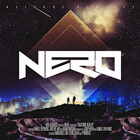
This poster for Nero uses the same image as the one for the CD cover. This synergy means that it is instantly recognisable for the audience and there is no ambiguity over who the artist is.


For my advert, I will take inspiration from the Chase and Status posters by keeping it simple, and also take the idea of having an image which is heavily linked to the song and video and recognisable for the audience.

27 January 2012

Research of CD Covers


These four CD covers are of a similar genre to Chase and Status but all have their own style. However, something which stays the same throughout is a bold album name and title which stands out  - this will suit the audience's needs as they will be obvious in a CD store such as HMV. The images on all four are, although obvious, not too detailed as to detract the attention from the CD text and have a central focal point.

25 January 2012

Research into Ancillary Task

I have searched for the album and single covers that Chase and Status have used in the past and have found these:

The most noticeable common theme that the four covers have is a colour palette of around three colours: black and/or white seem a favourite, but the desaturation of the two colours are contrasted with a much more vivid and brash colour. In the cover of 'Pieces', there is a number of shades used of the green, but the shattered effect ensures that the boldness is  not lost.


They are also very simple in their design with the band and name of the CD as the most prominent feature. They also all have some form of a design as a background or underneath the text: the dog in 'No More Idols', the band members in 'More Than Alot', the small picture of the dog in 'Blind Faith' and the shatter design in 'Pieces'. This meets the audience's needs as the CD will be easily recognisable in a shop as it is a common theme for Chase and Status to use.