Annabel Gammack 6118
17 April 2012
30 March 2012
3. What have you learnt from your audience feedback?
To gather my audience feedback I showed a focus group of 5 people who were part of my target audience firstly the video and then the ancillary task. I did it in this order so that I was then able to ask them what they felt were the most memorable parts of the video prior to seeing the ancillary task, as this was something I wanted to focus on when creating my digipak and poster.
I gave them the following questions to answer, and then gathered the information in order to see which were the most common feelings about my productions.
1. Before I show you the music video, what features would you expect to see in a video of this genre?
2. Now that you have seen the video, what do you feel are the most prominent aspects of the video that you would be most likely to recognise?
3. Do you feel that the video met the needs of the audience through the narrative?
4. Do you feel that the video met the needs of the audience through the editing?
5. Now that you have seen the ancillary tasks, do you find that you can recognise the features of them?
6. Do you feel that you would notice the CD and poster in a shop amongst other products?
7. Do you feel that the ancillary tasks suitably advertise the song and artist?
1. For the first answer, I got mixed answers. While one person said that he would surprised if there was not many special effects, another said that Chase and Status do not use many and so it would be odd if I were to use some in my production. Person 2 said that they were expecting young adults, which I met while person 4 and 5 highlighted how music videos are different to one another in the drum and bass genre and so it would be difficult to be specific one what they were expecting
2. For question 2, all 5 people said that the rabbit was one of the most striking and memorable aspects of the video. This is fortunate as this is what I have also used for my ancillary tasks and so for them to say that the rabbit is the most recognisable part without seeing the digipak and poster is really promising. As well as the rabbit, they also suggested that the female character, the vodka bottle and the church were also striking. I have carried through the element of the church but not the vodka bottle or the female character.
3. The third answer gave mixed reviews. Three people said that it did meet the audience's needs through narrative but two did not. Those who said it did said it did so because it was relatable to the target audience through the narrative of alcohol and because it was clearly structured into sections which made it easy to follow the narrative. However, those who said it didn't gave reasons that I did not go into enough depth and so at points the rabbit seemed quite out of place. Even so, I am not too concerned with this as I feel that due to the fantastical and confused nature of the narrative, it can be interpreted by the audience in their own way.
4. The group all liked aspects of the editing but some of them suggested doing some things differently. The parts that I was complimented on was the fast cuts as it matched the tempo and brought pace to an otherwise rather slow song. The target audience of teenagers would often live an intense lifestyle by going out clubbing and drinking and so the fast cuts reflect this. The adjustment of colours were also complimented as they helped to direct the audience through the narrative and so met their need of being understandable and coherent. One person noted the reversal of the vodka shot as it clearly depicted his struggle to recover. All these things helped to make the product more interesting for the audience to watch. However, someone said that due to it being a Chase and Status track, they were expecting a more "natural look" to match their style. On the other hand, even though it was a Chase and Status track, it did not mean that I was bound to their style but I could be inspired by it. I was also told that fast cuts should have been used throughout the whole song as the slow motion could get slightly dull and predictable.
5. It is important for my audience to be able to see the link between the ancillary tasks and the music video. Three of the people said that they immediately recognised the rabbit which is fantastic as this is the focal point of both my CD cover and the advert. It also means that I was write in choosing the rabbit as the main element as I have succeeded in creating products that the audience can remember. Another person said that they loved how the colour changes have been transferred from the video onto the CD as this creates synergy between products. To improve, they suggested that alcoholism should have been involved somewhere in the ancillary task as it is the foundation of my music video's narrative.
6. It is vital that my products stand out against others in a shop as there are hundreds of other EPs to compete with. All five of the people said that they would notice the front cover and the advert in a shop due to the rabbit which they are now familiar with and immediately link to the song. They also said that they'd notice it because of the bold colours which are striking against other covers and adverts which are sometimes rather dull. Despite this, one person did say that they are unsure as to whether they would notice the CD cover on a shelf with other CDs as the dark background may fade into the rest. The same problem is with the spine as there is nothing distinctive on it. However, I do not know what I would change in order to make it stand out more as it is so narrow.
7. Advertisement is really important and the feedback I got from my audience told me that because I have kept the backgrounds simple where the text is, this means that the artist and song title are clearly noticeable and do not get lost in detail. Due to the heavy use of the rabbit, this is advertising for the song on its own with one person saying how "anyone who has seen the video will recognise the rabbit and therefore the artist and track is being advertised by the single image". Despite this, some people also say that the rabbit loses its meaning if the video has not been seen and due to the focus on it, the artist gets lost. Therefore, Chase and Status should have been written in the same styled font amongst the two products in order to allow people who had not seen the video to still recognise an aspect of the ancillary tasks.
23 March 2012
2. How effective is the combination of your main product and your ancillary texts?
 Both my main product and my ancillary texts have common themes within their mise-en-scene and the colours that I’ve used.
  In the mise-en-scene, the most prominent feature of both is the rabbit. It is the most memorable aspect of the video and so it makes sense for it to be used on the front cover of the digipack as it is more recognisable than other areas of the narrative such as alcoholism. The rabbit is also the focus of the advertising poster, and so successfully links all three products together by having a common theme.
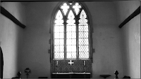
  One of the main locations of the video is the church. Within the church, the most overwhelming feature is the large window at the end. Therefore, as a second but subtle link between the video and the digipack is the glass effect that I have put on the background of the front cover and on the protagonist on the back.
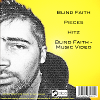
The second theme, the colour, also links between the three products. Firstly, as seen in the video, the protagonist is desaturated on the back cover of the digipack too as a reminder of the narrative and his emotion in the video. When not desaturated, the footage in the video is bold colours (red and blue). On the back cover, to contrast with the desaturation of the man and to form a link between the video, there is a block colour of yellow. The contrast between the yellow and the desaturation is exemplified due to the connotations of yellow as being happy and energetic.
The needs of the target audience have been met in a number of ways. By conforming to the conventions of the genre by distorting reality through the introduction of the rabbit, I have succeeded in creating a theme that my target audience would be accustomed to.
 I have also met the needs of my audience through the editing stages. The adjustment of colour, as well as telling my audience the mood of the product and helping to lead them through the narrative, is also conventional of the genre as quite often footage is manipulated to be brighter and more energized due to the dance nature of the music. The fast cuts that I have used build upon this convention of high energy and help to reflect the narrative as well as making the video more interesting for the audience to watch.
There is also the intertextual reference to ‘Alice in Wonderland’ due to the rabbit. Although it is not referenced as heavily as I originally planned, the white rabbit is still a main feature throughout both my video and ancillary task.
 My products successfully advertise the song, artist and institution because the institution logo is clearly displayed on both the spine of the CD cover and the back, while the song title and artist is also clear on the front cover, spine, and advertising poster. As the rabbit is such a noticeable element for the product, this is further promotion as it becomes a recognizable symbol for the artist.
18 March 2012
1. In what ways does your media production use, develop or challenge forms and conventions of real media products?
Answer in text form
In order to meet my audience’s needs, I made sure that I researched into both the genre of drum and bass and also the band Chase and Status itself.
In my ancillary task, I used the convention of a simple colour scheme, seen often in Chase and Status’ CD covers. Their ‘Pieces’ EP involved shades of green, while their ‘Blind Faith’ EP used yellow. In my digipack, I used yellow, black, and white. This met the audiences needs by maintaining a style that they are accustomed to.
A second way I used conventions in my ancillary task was by taking a single element as a focus. In my production, this was the rabbit as it is the most unusual and memorable aspect of the video. Chase and Status often use a single focus for their EPs too. For ‘Pieces’, the element is a shatter effect to match the song title. For their ‘No More Idols’ CD cover, they have the focus of a bulldog.
I also used conventions in my music video. I did this through the narrative of alchohol abuse. This is conventional as drum and bass videos often revolve around teenage life as this is their target audience. Teenage years are the time where most young people rebel and consume alcohol.
I have developed my footage through the reversal of the vodka shot to connote the protagonist’s attempts at recovery. It is a shot used before in the music video too and so is recognizable to the audience.
To challenge conventions, I have heavily edited the footage in my music video through light rays and the RGB balance. This is a challenge of Chase and Status’ videos as they are often simple and do not heavily feature special effects. I challenged this convention because it suited the fantastical nature of my narrative.
10 March 2012
Subscribe to:
Comments (Atom)


