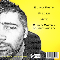
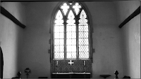
 Both my main product and my ancillary texts have common themes within their mise-en-scene and the colours that I’ve used.
  In the mise-en-scene, the most prominent feature of both is the rabbit. It is the most memorable aspect of the video and so it makes sense for it to be used on the front cover of the digipack as it is more recognisable than other areas of the narrative such as alcoholism. The rabbit is also the focus of the advertising poster, and so successfully links all three products together by having a common theme.
  One of the main locations of the video is the church. Within the church, the most overwhelming feature is the large window at the end. Therefore, as a second but subtle link between the video and the digipack is the glass effect that I have put on the background of the front cover and on the protagonist on the back.
The second theme, the colour, also links between the three products. Firstly, as seen in the video, the protagonist is desaturated on the back cover of the digipack too as a reminder of the narrative and his emotion in the video. When not desaturated, the footage in the video is bold colours (red and blue). On the back cover, to contrast with the desaturation of the man and to form a link between the video, there is a block colour of yellow. The contrast between the yellow and the desaturation is exemplified due to the connotations of yellow as being happy and energetic.
The needs of the target audience have been met in a number of ways. By conforming to the conventions of the genre by distorting reality through the introduction of the rabbit, I have succeeded in creating a theme that my target audience would be accustomed to.
 I have also met the needs of my audience through the editing stages. The adjustment of colour, as well as telling my audience the mood of the product and helping to lead them through the narrative, is also conventional of the genre as quite often footage is manipulated to be brighter and more energized due to the dance nature of the music. The fast cuts that I have used build upon this convention of high energy and help to reflect the narrative as well as making the video more interesting for the audience to watch.
There is also the intertextual reference to ‘Alice in Wonderland’ due to the rabbit. Although it is not referenced as heavily as I originally planned, the white rabbit is still a main feature throughout both my video and ancillary task.
 My products successfully advertise the song, artist and institution because the institution logo is clearly displayed on both the spine of the CD cover and the back, while the song title and artist is also clear on the front cover, spine, and advertising poster. As the rabbit is such a noticeable element for the product, this is further promotion as it becomes a recognizable symbol for the artist.

No comments:
Post a Comment