29 February 2012

Inside Covers of the Ancillary Task

After consideration, I have decided to replace the current images with new ones as I feel that even if I edit them to link more to the other covers and poster, they still do not link enough to the rabbit and protagonist.

Fortunately, when I was taking photographs for my ancillary task originally, I took so many that I have a lot to choose from and so re-organising some time to take more photos is unnecessary.
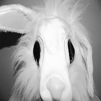
I have found two shots that I am interested in using. The first, which would go on the inside left cover, is an extreme close up of the rabbit's head without it's mouth. The second, which would go on the right, is of the mouth. I think these two shots would be useful to include as it looks as if the same photograph has been cut in half and this manipulation and disfigurement is similar to the way the protagonist's reality and life has become warped.

By having the two inside images in black and white, it does not overpower the digipak with too much colour and connotes that when looked into deep enough (i.e. inside) it is clear that the life that is being lived by the protagonist is mundane and lacklustre (no colour or vibrancy); it's as if the audience will be looking inside the mind.

24 February 2012

Feedback on Ancillary Task

After handing in my first draft of my ancillary tasks, I have decided to act upon some feedback I was given.

The first bit of advice I was given was to change the rabbit on the poster from being at the top to the side with half of its face not visible, just like the front cover of the CD as this creates a heavier link between the two and also adds mystery and ambiguity to the rabbit which is the same in the video.

The front and back covers were complimented and so, apart from adding in a copyright statement to the back cover, I do not need to edit these.

However, the inside covers were probably the biggest issue as they do not feel as if they link to the rest of the digipak.This is because they do not feature the rabbit or male and are also edited in a different way. Therefore, I will probably either edit them differently or change the images. Either way, this is the main thing that I am focussing on from my feedback.

16 February 2012

Editing the Digipak

 Editing my images has been difficult as this is the first time that I have used photoshop so I am completely new to the way it works. Therefore, it has been a rather slow process in being able to alter the images to how I would like.

I have come across an effect called 'stained glass'. This is really useful to me as it relates to the church window and means that I can bring aspects of the inside of the CD cover to the front.

For the front cover, I have made the rabbit stand out by heightening the contrast of the pink, white and black colours that are in it. This is then put against a blank background with a stained glass effect which subtly makes the cover more interesting without detracting the attention away from the rabbit.

 For the back cover, to mirror the front, the male is black and white with the stained glass effect on him. This puts all the effect on him and by being heavily edited there is connotations that his life has been warped by his addiction and has taken his humanity away. The background for the back cover is block yellow in reference to the striking colours used in the fantastical narrative of the video.

Inside, I have made the each section of the church window a different colour, connoting that outside of reality is a much more fun and exciting world aka the 'wonderland'. It also means that although it is taken from the video, it is not identical to the footage and so makes it more interesting for the audience.

The flame has been edited to highlight the orange and red in the shot, linking back to the bright colours of the video and also connoting danger and anger.

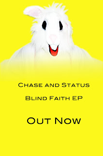
With the poster, I have put the rabbit at the top of the advert with the text underneath. Rather than having a harsh line where the body of the rabbit ends, I have gradually faded it out to connote that the rabbit is an embodiment of Chase and Status and they are one and the same thing, creating an intertextual reference for the band in the future.

9 February 2012

Covers for the Ancillary Task

For my front cover, I feel it would be most beneficial to the audience to have the rabbit as the focus. It will be the most unusual against other CD covers of the band members/singers yet be linked enough to the track to be recognisable.

The back cover will be of the male on the opposite side of the cover to the rabbit. Both of them will only be showing half of their faces to add a mysterious effect to the rabbit and connote that the male has lost himself in his addiction.

It will also create a link between the two, implying that they are one and the same person.

Inside, I am planning on taking stills from the video - the church window and the flame from the lighter. This is because they represent two significant sections to the video.

8 February 2012

Images for my Ancillary Task

For my ancillary task, I am including images of the male character and the rabbit as these are the two most prominent features of the video.


Rather than importing a still from my video, I am going to take photos of the rabbit and the protagonist in front of a blank wall so that when it comes to using Photoshop to edit them it will be easy to manipulate the background.

3 February 2012

Paradise - Coldplay


Although a different genre of music and narrative, Coldplay's video for 'Paradise' is similar to my music video as they both use animals as a significant and key feature (elephant/rabbit). As the song has reached the top of the charts and the VEVO video hits on youtube is over 64 million, the elephant has become a symbol of the band and song, as well as getting people talking about it as it is an original and exciting idea.

Coldplay are furthering this by dressing as elephants for live shows as well (footage is seen in the 'Paradise' video) which is more advertising for the song.


Thoughts for my Ancillary Task

After researching into CD covers that Chase and Status use, other bands of a similar genre use and key features of my music video, I am leaning towards having the rabbit in both the CD cover and the ancillary task. For my ancillary task, I need four shots for the CD (front cover, back cover, inside left, and inside right) and a shot for my poster.

Most of the CD covers are simplistic in their design, and so, although the wood is used as a main location in the music video, I feel it would be more significant to have the rabbit against a blank canvas. This would also allow me to have the text of the artist and song title in lettering which would be easily noticeable and not lost against a detailed background.

For the poster, a similar style should be used so that the audience can see a clear link between the music video and the digipack and poster. This would create some kind of 'symbol' for the artist and song which could then be an easily recognisable feature. The blank canvas would mean that details of the song are easily read.

Recognisable Features of my Music Video

The church plays a significant part in both the setting and the narrative of my music video. If I were to use the church for my ancillary task, it would be beneficial due to this but disadvantaging as I am unsure whether it is easily recognisable.

Having my protagonist walking alongside the woods is a sequence that I use quite a lot in my music video. It is a symbolic shot of the narrative but, similar to the church, I am not convinced that it would meet my target audiences' needs in being a clear reference to the song. 
The sequence of the protagonist and his father is a key feature in demonstrating the tension the protagonist's addiction is putting on other people. I could definately gain inspiration from this shot, but specifically this footage would not be suitable as the colours are not bright enough to get audience's attention. 
Drink is a key item in my music video and so it would be necessary to involve it in my ancillary task. However, I would not use it as the main feature of the poster or CD cover as it is quite a common prop in narratives for music videos and so perhaps may not be immediately linked to 'Blind Faith'. 

The rabbit is the most recognisable and significant feature of my music video; it demonstrates the protagonist's addictions and how he is spiralling further from reality. 
The shot of both the rabbit and the protagonist together is significant because it shows the protagonists' new reality and perspective based upon drink, and also how he tries to confront his addiction (facing each other in a kind of 'stand off' position).