17 April 2012
30 March 2012
3. What have you learnt from your audience feedback?
To gather my audience feedback I showed a focus group of 5 people who were part of my target audience firstly the video and then the ancillary task. I did it in this order so that I was then able to ask them what they felt were the most memorable parts of the video prior to seeing the ancillary task, as this was something I wanted to focus on when creating my digipak and poster.
I gave them the following questions to answer, and then gathered the information in order to see which were the most common feelings about my productions.
1. Before I show you the music video, what features would you expect to see in a video of this genre?
2. Now that you have seen the video, what do you feel are the most prominent aspects of the video that you would be most likely to recognise?
3. Do you feel that the video met the needs of the audience through the narrative?
4. Do you feel that the video met the needs of the audience through the editing?
5. Now that you have seen the ancillary tasks, do you find that you can recognise the features of them?
6. Do you feel that you would notice the CD and poster in a shop amongst other products?
7. Do you feel that the ancillary tasks suitably advertise the song and artist?
1. For the first answer, I got mixed answers. While one person said that he would surprised if there was not many special effects, another said that Chase and Status do not use many and so it would be odd if I were to use some in my production. Person 2 said that they were expecting young adults, which I met while person 4 and 5 highlighted how music videos are different to one another in the drum and bass genre and so it would be difficult to be specific one what they were expecting
2. For question 2, all 5 people said that the rabbit was one of the most striking and memorable aspects of the video. This is fortunate as this is what I have also used for my ancillary tasks and so for them to say that the rabbit is the most recognisable part without seeing the digipak and poster is really promising. As well as the rabbit, they also suggested that the female character, the vodka bottle and the church were also striking. I have carried through the element of the church but not the vodka bottle or the female character.
3. The third answer gave mixed reviews. Three people said that it did meet the audience's needs through narrative but two did not. Those who said it did said it did so because it was relatable to the target audience through the narrative of alcohol and because it was clearly structured into sections which made it easy to follow the narrative. However, those who said it didn't gave reasons that I did not go into enough depth and so at points the rabbit seemed quite out of place. Even so, I am not too concerned with this as I feel that due to the fantastical and confused nature of the narrative, it can be interpreted by the audience in their own way.
4. The group all liked aspects of the editing but some of them suggested doing some things differently. The parts that I was complimented on was the fast cuts as it matched the tempo and brought pace to an otherwise rather slow song. The target audience of teenagers would often live an intense lifestyle by going out clubbing and drinking and so the fast cuts reflect this. The adjustment of colours were also complimented as they helped to direct the audience through the narrative and so met their need of being understandable and coherent. One person noted the reversal of the vodka shot as it clearly depicted his struggle to recover. All these things helped to make the product more interesting for the audience to watch. However, someone said that due to it being a Chase and Status track, they were expecting a more "natural look" to match their style. On the other hand, even though it was a Chase and Status track, it did not mean that I was bound to their style but I could be inspired by it. I was also told that fast cuts should have been used throughout the whole song as the slow motion could get slightly dull and predictable.
5. It is important for my audience to be able to see the link between the ancillary tasks and the music video. Three of the people said that they immediately recognised the rabbit which is fantastic as this is the focal point of both my CD cover and the advert. It also means that I was write in choosing the rabbit as the main element as I have succeeded in creating products that the audience can remember. Another person said that they loved how the colour changes have been transferred from the video onto the CD as this creates synergy between products. To improve, they suggested that alcoholism should have been involved somewhere in the ancillary task as it is the foundation of my music video's narrative.
6. It is vital that my products stand out against others in a shop as there are hundreds of other EPs to compete with. All five of the people said that they would notice the front cover and the advert in a shop due to the rabbit which they are now familiar with and immediately link to the song. They also said that they'd notice it because of the bold colours which are striking against other covers and adverts which are sometimes rather dull. Despite this, one person did say that they are unsure as to whether they would notice the CD cover on a shelf with other CDs as the dark background may fade into the rest. The same problem is with the spine as there is nothing distinctive on it. However, I do not know what I would change in order to make it stand out more as it is so narrow.
7. Advertisement is really important and the feedback I got from my audience told me that because I have kept the backgrounds simple where the text is, this means that the artist and song title are clearly noticeable and do not get lost in detail. Due to the heavy use of the rabbit, this is advertising for the song on its own with one person saying how "anyone who has seen the video will recognise the rabbit and therefore the artist and track is being advertised by the single image". Despite this, some people also say that the rabbit loses its meaning if the video has not been seen and due to the focus on it, the artist gets lost. Therefore, Chase and Status should have been written in the same styled font amongst the two products in order to allow people who had not seen the video to still recognise an aspect of the ancillary tasks.
23 March 2012
2. How effective is the combination of your main product and your ancillary texts?
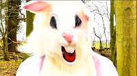 Both my main product and my ancillary texts have common themes within their mise-en-scene and the colours that I’ve used.
  In the mise-en-scene, the most prominent feature of both is the rabbit. It is the most memorable aspect of the video and so it makes sense for it to be used on the front cover of the digipack as it is more recognisable than other areas of the narrative such as alcoholism. The rabbit is also the focus of the advertising poster, and so successfully links all three products together by having a common theme.
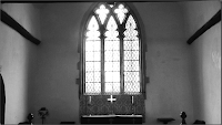
  One of the main locations of the video is the church. Within the church, the most overwhelming feature is the large window at the end. Therefore, as a second but subtle link between the video and the digipack is the glass effect that I have put on the background of the front cover and on the protagonist on the back.
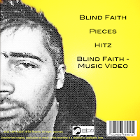
The second theme, the colour, also links between the three products. Firstly, as seen in the video, the protagonist is desaturated on the back cover of the digipack too as a reminder of the narrative and his emotion in the video. When not desaturated, the footage in the video is bold colours (red and blue). On the back cover, to contrast with the desaturation of the man and to form a link between the video, there is a block colour of yellow. The contrast between the yellow and the desaturation is exemplified due to the connotations of yellow as being happy and energetic.
The needs of the target audience have been met in a number of ways. By conforming to the conventions of the genre by distorting reality through the introduction of the rabbit, I have succeeded in creating a theme that my target audience would be accustomed to.
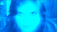
 I have also met the needs of my audience through the editing stages. The adjustment of colour, as well as telling my audience the mood of the product and helping to lead them through the narrative, is also conventional of the genre as quite often footage is manipulated to be brighter and more energized due to the dance nature of the music. The fast cuts that I have used build upon this convention of high energy and help to reflect the narrative as well as making the video more interesting for the audience to watch.
There is also the intertextual reference to ‘Alice in Wonderland’ due to the rabbit. Although it is not referenced as heavily as I originally planned, the white rabbit is still a main feature throughout both my video and ancillary task.
 My products successfully advertise the song, artist and institution because the institution logo is clearly displayed on both the spine of the CD cover and the back, while the song title and artist is also clear on the front cover, spine, and advertising poster. As the rabbit is such a noticeable element for the product, this is further promotion as it becomes a recognizable symbol for the artist.
18 March 2012
1. In what ways does your media production use, develop or challenge forms and conventions of real media products?
Answer in text form
In order to meet my audience’s needs, I made sure that I researched into both the genre of drum and bass and also the band Chase and Status itself.
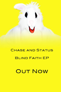
In my ancillary task, I used the convention of a simple colour scheme, seen often in Chase and Status’ CD covers. Their ‘Pieces’ EP involved shades of green, while their ‘Blind Faith’ EP used yellow. In my digipack, I used yellow, black, and white. This met the audiences needs by maintaining a style that they are accustomed to.
A second way I used conventions in my ancillary task was by taking a single element as a focus. In my production, this was the rabbit as it is the most unusual and memorable aspect of the video. Chase and Status often use a single focus for their EPs too. For ‘Pieces’, the element is a shatter effect to match the song title. For their ‘No More Idols’ CD cover, they have the focus of a bulldog.
I also used conventions in my music video. I did this through the narrative of alchohol abuse. This is conventional as drum and bass videos often revolve around teenage life as this is their target audience. Teenage years are the time where most young people rebel and consume alcohol.
I have developed my footage through the reversal of the vodka shot to connote the protagonist’s attempts at recovery. It is a shot used before in the music video too and so is recognizable to the audience.
To challenge conventions, I have heavily edited the footage in my music video through light rays and the RGB balance. This is a challenge of Chase and Status’ videos as they are often simple and do not heavily feature special effects. I challenged this convention because it suited the fantastical nature of my narrative.
10 March 2012
29 February 2012
Inside Covers of the Ancillary Task
After consideration, I have decided to replace the current images with new ones as I feel that even if I edit them to link more to the other covers and poster, they still do not link enough to the rabbit and protagonist.
Fortunately, when I was taking photographs for my ancillary task originally, I took so many that I have a lot to choose from and so re-organising some time to take more photos is unnecessary.
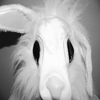 I have found two shots that I am interested in using. The first, which would go on the inside left cover, is an extreme close up of the rabbit's head without it's mouth. The second, which would go on the right, is of the mouth. I think these two shots would be useful to include as it looks as if the same photograph has been cut in half and this manipulation and disfigurement is similar to the way the protagonist's reality and life has become warped.
By having the two inside images in black and white, it does not overpower the digipak with too much colour and connotes that when looked into deep enough (i.e. inside) it is clear that the life that is being lived by the protagonist is mundane and lacklustre (no colour or vibrancy); it's as if the audience will be looking inside the mind.
Fortunately, when I was taking photographs for my ancillary task originally, I took so many that I have a lot to choose from and so re-organising some time to take more photos is unnecessary.
 I have found two shots that I am interested in using. The first, which would go on the inside left cover, is an extreme close up of the rabbit's head without it's mouth. The second, which would go on the right, is of the mouth. I think these two shots would be useful to include as it looks as if the same photograph has been cut in half and this manipulation and disfigurement is similar to the way the protagonist's reality and life has become warped.
By having the two inside images in black and white, it does not overpower the digipak with too much colour and connotes that when looked into deep enough (i.e. inside) it is clear that the life that is being lived by the protagonist is mundane and lacklustre (no colour or vibrancy); it's as if the audience will be looking inside the mind.
24 February 2012
Feedback on Ancillary Task
After handing in my first draft of my ancillary tasks, I have decided to act upon some feedback I was given.
The first bit of advice I was given was to change the rabbit on the poster from being at the top to the side with half of its face not visible, just like the front cover of the CD as this creates a heavier link between the two and also adds mystery and ambiguity to the rabbit which is the same in the video.
The front and back covers were complimented and so, apart from adding in a copyright statement to the back cover, I do not need to edit these.
However, the inside covers were probably the biggest issue as they do not feel as if they link to the rest of the digipak.This is because they do not feature the rabbit or male and are also edited in a different way. Therefore, I will probably either edit them differently or change the images. Either way, this is the main thing that I am focussing on from my feedback.
16 February 2012
Editing the Digipak
Editing my images has been difficult as this is the first time that I have used photoshop so I am completely new to the way it works. Therefore, it has been a rather slow process in being able to alter the images to how I would like.
I have come across an effect called 'stained glass'. This is really useful to me as it relates to the church window and means that I can bring aspects of the inside of the CD cover to the front.
 For the front cover, I have made the rabbit stand out by heightening the contrast of the pink, white and black colours that are in it. This is then put against a blank background with a stained glass effect which subtly makes the cover more interesting without detracting the attention away from the rabbit.
For the back cover, to mirror the front, the male is black and white with the stained glass effect on him. This puts all the effect on him and by being heavily edited there is connotations that his life has been warped by his addiction and has taken his humanity away. The background for the back cover is block yellow in reference to the striking colours used in the fantastical narrative of the video.
 Inside, I have made the each section of the church window a different colour, connoting that outside of reality is a much more fun and exciting world aka the 'wonderland'. It also means that although it is taken from the video, it is not identical to the footage and so makes it more interesting for the audience.
 The flame has been edited to highlight the orange and red in the shot, linking back to the bright colours of the video and also connoting danger and anger.
 With the poster, I have put the rabbit at the top of the advert with the text underneath. Rather than having a harsh line where the body of the rabbit ends, I have gradually faded it out to connote that the rabbit is an embodiment of Chase and Status and they are one and the same thing, creating an intertextual reference for the band in the future.
I have come across an effect called 'stained glass'. This is really useful to me as it relates to the church window and means that I can bring aspects of the inside of the CD cover to the front.
 For the front cover, I have made the rabbit stand out by heightening the contrast of the pink, white and black colours that are in it. This is then put against a blank background with a stained glass effect which subtly makes the cover more interesting without detracting the attention away from the rabbit.
For the back cover, to mirror the front, the male is black and white with the stained glass effect on him. This puts all the effect on him and by being heavily edited there is connotations that his life has been warped by his addiction and has taken his humanity away. The background for the back cover is block yellow in reference to the striking colours used in the fantastical narrative of the video.
 Inside, I have made the each section of the church window a different colour, connoting that outside of reality is a much more fun and exciting world aka the 'wonderland'. It also means that although it is taken from the video, it is not identical to the footage and so makes it more interesting for the audience.
 The flame has been edited to highlight the orange and red in the shot, linking back to the bright colours of the video and also connoting danger and anger.
 With the poster, I have put the rabbit at the top of the advert with the text underneath. Rather than having a harsh line where the body of the rabbit ends, I have gradually faded it out to connote that the rabbit is an embodiment of Chase and Status and they are one and the same thing, creating an intertextual reference for the band in the future.
9 February 2012
Covers for the Ancillary Task
For my front cover, I feel it would be most beneficial to the audience to have the rabbit as the focus. It will be the most unusual against other CD covers of the band members/singers yet be linked enough to the track to be recognisable.
The back cover will be of the male on the opposite side of the cover to the rabbit. Both of them will only be showing half of their faces to add a mysterious effect to the rabbit and connote that the male has lost himself in his addiction.
It will also create a link between the two, implying that they are one and the same person.
Inside, I am planning on taking stills from the video - the church window and the flame from the lighter. This is because they represent two significant sections to the video.
8 February 2012
Images for my Ancillary Task
 For my ancillary task, I am including images of the male character and the rabbit as these are the two most prominent features of the video.
 Rather than importing a still from my video, I am going to take photos of the rabbit and the protagonist in front of a blank wall so that when it comes to using Photoshop to edit them it will be easy to manipulate the background.
3 February 2012
Paradise - Coldplay
 Coldplay are furthering this by dressing as elephants for live shows as well (footage is seen in the 'Paradise' video) which is more advertising for the song.
Thoughts for my Ancillary Task
After researching into CD covers that Chase and Status use, other bands of a similar genre use and key features of my music video, I am leaning towards having the rabbit in both the CD cover and the ancillary task. For my ancillary task, I need four shots for the CD (front cover, back cover, inside left, and inside right) and a shot for my poster.
Most of the CD covers are simplistic in their design, and so, although the wood is used as a main location in the music video, I feel it would be more significant to have the rabbit against a blank canvas. This would also allow me to have the text of the artist and song title in lettering which would be easily noticeable and not lost against a detailed background.
For the poster, a similar style should be used so that the audience can see a clear link between the music video and the digipack and poster. This would create some kind of 'symbol' for the artist and song which could then be an easily recognisable feature. The blank canvas would mean that details of the song are easily read.
Recognisable Features of my Music Video
The church plays a significant part in both the setting and the narrative of my music video. If I were to use the church for my ancillary task, it would be beneficial due to this but disadvantaging as I am unsure whether it is easily recognisable.
Having my protagonist walking alongside the woods is a sequence that I use quite a lot in my music video. It is a symbolic shot of the narrative but, similar to the church, I am not convinced that it would meet my target audiences' needs in being a clear reference to the song.
The sequence of the protagonist and his father is a key feature in demonstrating the tension the protagonist's addiction is putting on other people. I could definately gain inspiration from this shot, but specifically this footage would not be suitable as the colours are not bright enough to get audience's attention.
Drink is a key item in my music video and so it would be necessary to involve it in my ancillary task. However, I would not use it as the main feature of the poster or CD cover as it is quite a common prop in narratives for music videos and so perhaps may not be immediately linked to 'Blind Faith'.
The rabbit is the most recognisable and significant feature of my music video; it demonstrates the protagonist's addictions and how he is spiralling further from reality.
The shot of both the rabbit and the protagonist together is significant because it shows the protagonists' new reality and perspective based upon drink, and also how he tries to confront his addiction (facing each other in a kind of 'stand off' position).
28 January 2012
Research of Posters
These three posters are by Chase and Status and Nero, advertising upcoming shows and tours. Although I am planning to create an advertisement poster for the EP rather than a tour, I can still use these products to get inspiration and an idea of what style to use.
As seen on the CD covers, Chase and Status have a very simple style with a minimal colour palette. They do not overcrowd the poster, connoting that they are a group which need no introduction. Their audiences will be accustomed to this style and will know what kind of designs they are looking for when it comes to finding Chase and Status products.
This poster for Nero uses the same image as the one for the CD cover. This synergy means that it is instantly recognisable for the audience and there is no ambiguity over who the artist is.
For my advert, I will take inspiration from the Chase and Status posters by keeping it simple, and also take the idea of having an image which is heavily linked to the song and video and recognisable for the audience.
27 January 2012
Research of CD Covers


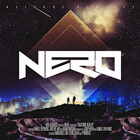

These four CD covers are of a similar genre to Chase and Status but all have their own style. However, something which stays the same throughout is a bold album name and title which stands out - this will suit the audience's needs as they will be obvious in a CD store such as HMV. The images on all four are, although obvious, not too detailed as to detract the attention from the CD text and have a central focal point.
25 January 2012
Research into Ancillary Task
I have searched for the album and single covers that Chase and Status have used in the past and have found these:
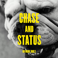
The most noticeable common theme that the four covers have is a colour palette of around three colours: black and/or white seem a favourite, but the desaturation of the two colours are contrasted with a much more vivid and brash colour. In the cover of 'Pieces', there is a number of shades used of the green, but the shattered effect ensures that the boldness is not lost.
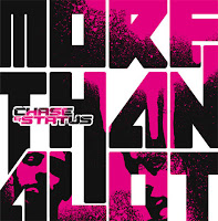 They are also very simple in their design with the band and name of the CD as the most prominent feature. They also all have some form of a design as a background or underneath the text: the dog in 'No More Idols', the band members in 'More Than Alot', the small picture of the dog in 'Blind Faith' and the shatter design in 'Pieces'. This meets the audience's needs as the CD will be easily recognisable in a shop as it is a common theme for Chase and Status to use.
Subscribe to:
Comments (Atom)


